Project: Netflix Data Analysis and Visualization with Python
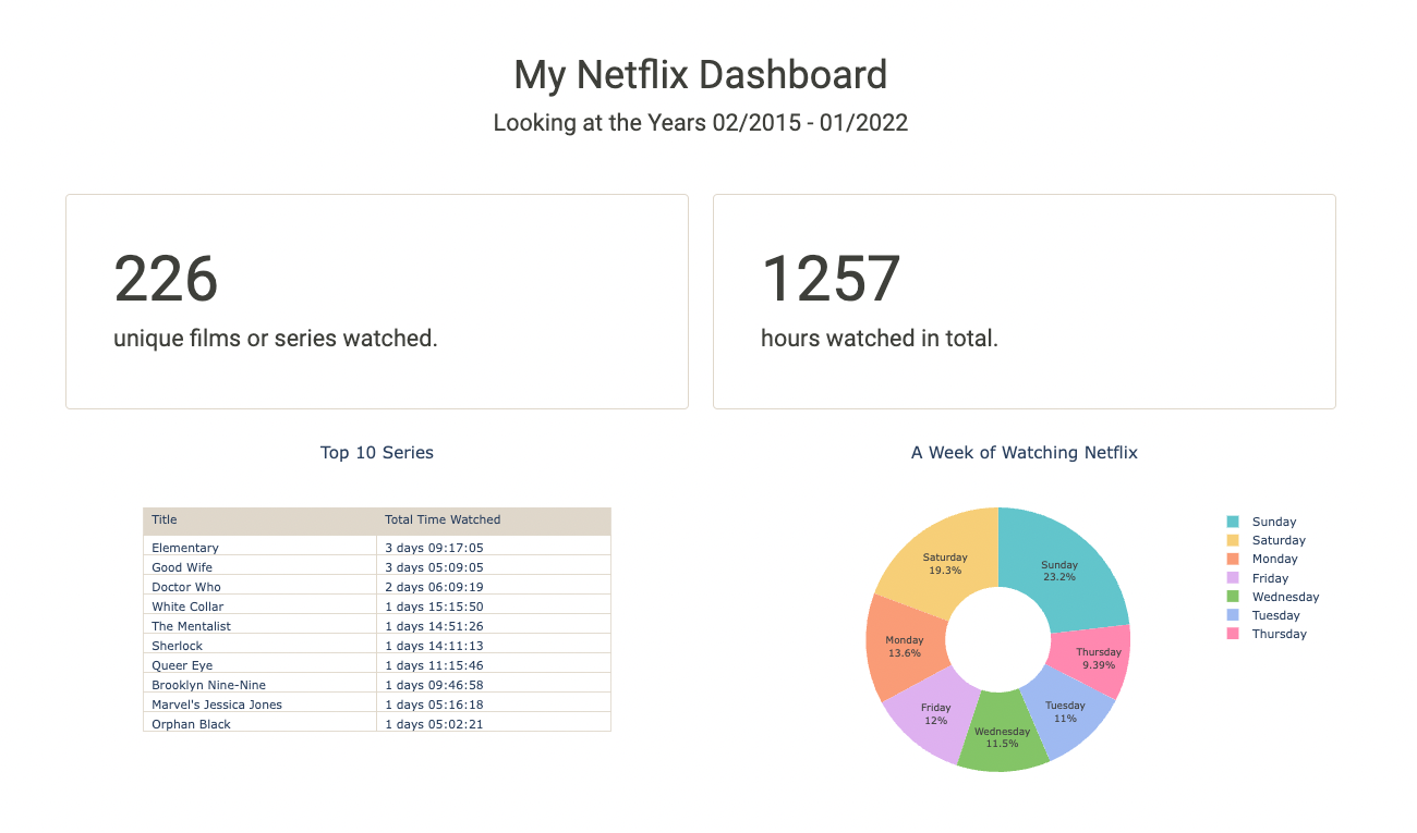
Table of Contents
General Info
This is a compact Data Visualization project I worked on for fun and to deepen my knowledge about visualizations and graphs using python libraries.
From conception and design to every line of code, the entire Dashboard was worked on by myself. During this project, I was able to repeat and deepen what I had previously learned in my Data Science course of study. Especially, I was able to familiarize myself with pandas and work on my data visualization skills, which I greatly enjoied!
The dataset I used for the Netflix data analytics task consists of my personal Netflix data, which I requested through their website. You can get access to your own data through this link. Feel free to download it and use my code to look into your own viewing behaviour ?
Installation
Requirements: Make sure you have Python 3.7+ installed on your computer. You can download the latest version of Python here.
Req. Packages:
- pandas
- dash
- dash_bootstrap_components
- ploty.express
- plotly.graph_objects
Demo
Demo_MyNetflixDashboard_komprimiert.mov
Usage and Main Functionalities
Want to know more about your own Netflix behaviour? For test usage you can download your own Netflix data. Just follow this link and Netflix will send you your personal data.
Please also refer to the comments within the code itself to get more information on the functionalities of the program.
0. Preparing the data for analysis
- This part cleans up the original data and prepares it for analysis.
- In the process, columns that are not needed are dropped.
- Time data is converted into appropriate time formats and split into several columns. The days of the week are added.
- In addition, the titles of the movies/series are split (title, season number, episode name).
1. Analysis
- This part of the code is about analyzing the data.
- We find out how many movies or series were watched over the entire period. We also count the total number of hours Netflix was watched.
- A pie chart is created that shows which days of the week are watched.
- In addition, the top 10 series that were watched the longest (in terms of total duration) are displayed.
- A line chart shows Netflix viewing behavior over the years, counting the total number of hours Netflix was watched.

2. Dash App Layout
- plotly’s Dash is now used to create an Interactive Dashboard of Netflix data.
- The individual graphics and texts are arranged in rows and containers.
- This part also includes a dropdown menu that the user can interact with.
3. App Callback
- Here we connect an interactive bar chart to the Dash Components.
- The chart represents our total annual hours of Netflix watched, grouped by month. The chart is filterable by year.

Contributing
Your comments, suggestions, and contributions are welcome. Please feel free to contribute pull requests or create issues for bugs and feature requests.