Pandas_Alive
Pandas_Alive is intended to provide a plotting backend for animated matplotlib charts for Pandas DataFrames, similar to the already existing Visualization feature of Pandas.
With Pandas_Alive, creating stunning, animated visualisations is as easy as calling:
df.plot_animated()

Installation
Install with pip install pandas_alive
Usage
As this package builds upon bar_chart_race, the example data set is sourced from there.
Must begin with a pandas DataFrame containing 'wide' data where:
- Every row represents a single period of time
- Each column holds the value for a particular category
- The index contains the time component (optional)
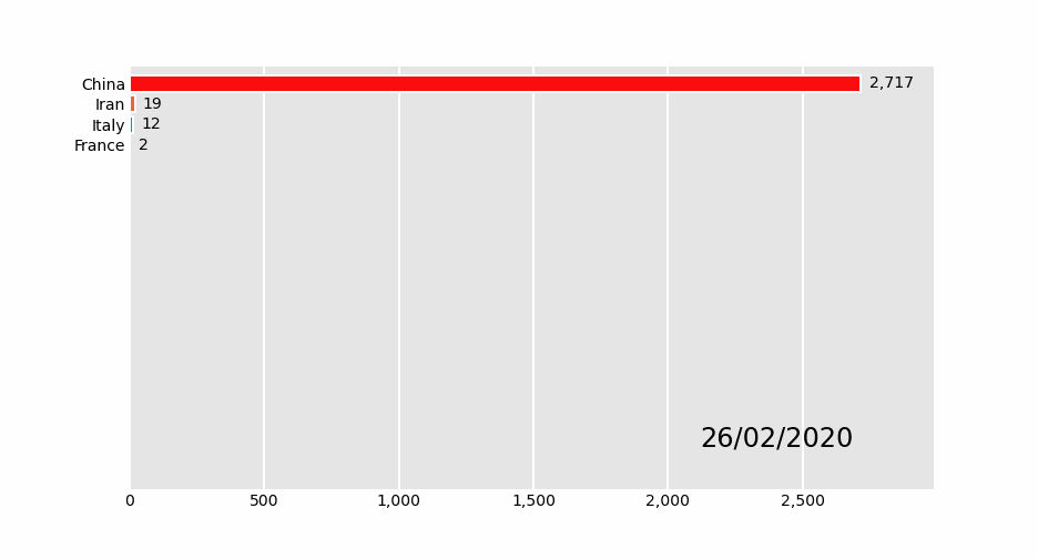
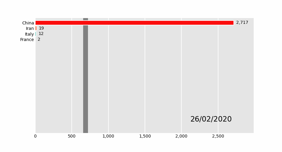
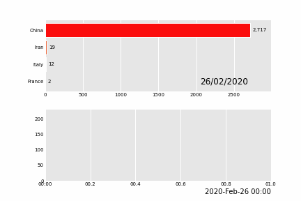
The data below is an example of properly formatted data. It shows total deaths from COVID-19 for the highest 20 countries by date.

To produce the above visualisation:
- Check Requirements first to ensure you have the tooling installed!
- Call
plot_animated()on the DataFrame- Either specify a file name to write to with
df.plot_animated(filename='example.mp4')or usedf.plot_animated().get_html5_videoto return a HTML5 video
- Either specify a file name to write to with
- Done!
import pandas_alive

covid_df = pandas_alive.load_dataset()

covid_df.plot_animated(filename='examples/example-barh-chart.gif')
Currently Supported Chart Types
pandas_alive current supports:
Horizontal Bar Charts
import pandas_alive

covid_df = pandas_alive.load_dataset()

covid_df.plot_animated(filename='example-barh-chart.gif')
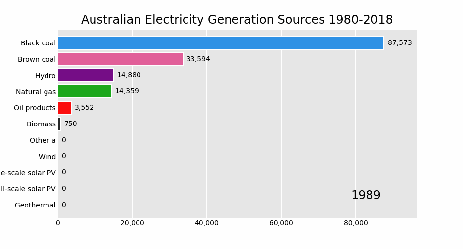
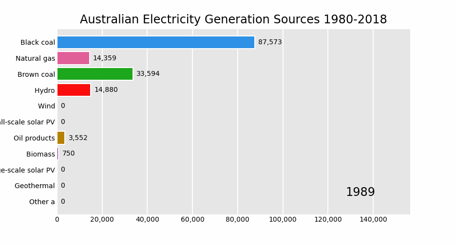
import pandas as pd
import pandas_alive

elec_df = pd.read_csv("data/Aus_Elec_Gen_1980_2018.csv",index_col=0,parse_dates=[0],thousands=',')

elec_df.fillna(0).plot_animated('examples/example-electricity-generated-australia.gif',period_fmt="%Y",title='Australian Electricity Generation Sources 1980-2018')
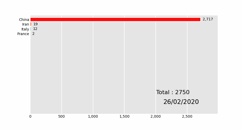
import pandas_alive

covid_df = pandas_alive.load_dataset()

def current_total(values):
    total = values.sum()
    s = f'Total : {int(total)}'
    return {'x': .85, 'y': .2, 's': s, 'ha': 'right', 'size': 11}

covid_df.plot_animated(filename='examples/summary-func-example.gif',period_summary_func=current_total)
import pandas as pd
import pandas_alive

elec_df = pd.read_csv("data/Aus_Elec_Gen_1980_2018.csv",index_col=0,parse_dates=[0],thousands=',')

elec_df.fillna(0).plot_animated('examples/fixed-example.gif',period_fmt="%Y",title='Australian Electricity Generation Sources 1980-2018',fixed_max=True,fixed_order=True)
import pandas_alive

covid_df = pandas_alive.load_dataset()

covid_df.plot_animated(filename='examples/perpendicular-example.gif',perpendicular_bar_func='mean')
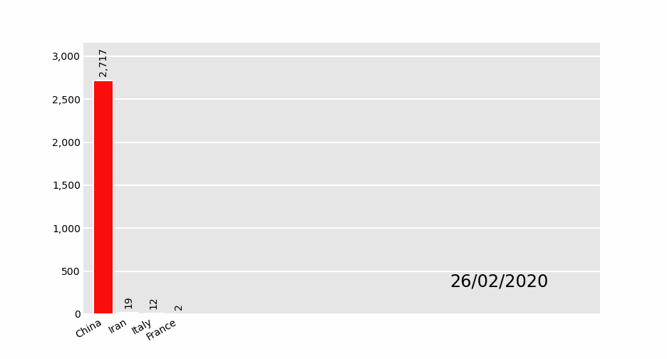
Vertical Bar Charts
import pandas_alive

covid_df = pandas_alive.load_dataset()

covid_df.plot_animated(filename='examples/example-barv-chart.gif',orientation='v')
Line Charts
With as many lines as data columns in the DataFrame.
import pandas_alive

covid_df = pandas_alive.load_dataset()

covid_df.diff().fillna(0).plot_animated(filename='examples/example-line-chart.gif',kind='line',period_label={'x':0.1,'y':0.9})
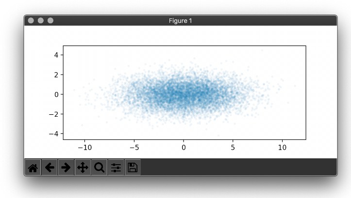
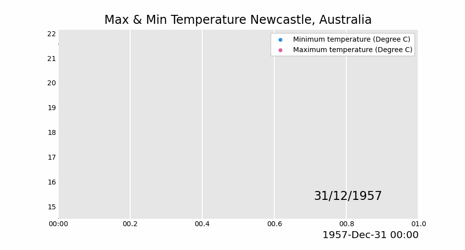
Scatter Charts
import pandas as pd
import pandas_alive

max_temp_df = pd.read_csv(
    "data/Newcastle_Australia_Max_Temps.csv",
    parse_dates={"Timestamp": ["Year", "Month", "Day"]},
)
min_temp_df = pd.read_csv(
    "data/Newcastle_Australia_Min_Temps.csv",
    parse_dates={"Timestamp": ["Year", "Month", "Day"]},
)

merged_temp_df = pd.merge_asof(max_temp_df, min_temp_df, on="Timestamp")

merged_temp_df.index = pd.to_datetime(merged_temp_df["Timestamp"].dt.strftime('%Y/%m/%d'))

keep_columns = ["Minimum temperature (Degree C)", "Maximum temperature (Degree C)"]

merged_temp_df[keep_columns].resample("Y").mean().plot_animated(filename='examples/example-scatter-chart.gif',kind="scatter",title='Max & Min Temperature Newcastle, Australia')
Pie Charts
import pandas_alive

covid_df = pandas_alive.load_dataset()

covid_df.plot_animated(filename='examples/example-pie-chart.gif',kind="pie",rotatelabels=True)

Multiple Charts
pandas_alive supports multiple animated charts in a single visualisation.
- Create a list of all charts to include in animation
- Use
animate_multiple_plotswith afilenameand the list of charts (this will usematplotlib.subplots) - Done!
import pandas_alive

covid_df = pandas_alive.load_dataset()

animated_line_chart = covid_df.diff().fillna(0).plot_animated(kind='line',period_label=False)

animated_bar_chart = covid_df.plot_animated(n_visible=10)

pandas_alive.animate_multiple_plots('examples/example-bar-and-line-chart.gif',[animated_bar_chart,animated_line_chart])
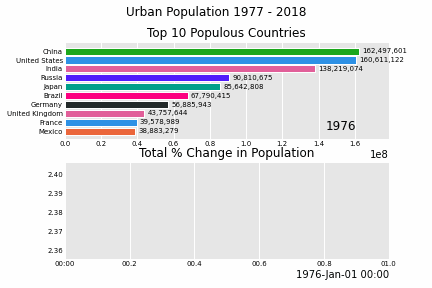
Urban Population
import pandas_alive

urban_df = pandas_alive.load_dataset("urban_pop")

animated_line_chart = (
    urban_df.sum(axis=1)
    .pct_change()
    .dropna()
    .mul(100)
    .plot_animated(kind="line", title="Total % Change in Population",period_label=False)
)

animated_bar_chart = urban_df.plot_animated(n_visible=10,title='Top 10 Populous Countries',period_fmt="%Y")

pandas_alive.animate_multiple_plots('examples/example-bar-and-line-urban-chart.gif',[animated_bar_chart,animated_line_chart],title='Urban Population 1977 - 2018',adjust_subplot_top=0.85)
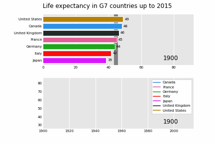
Life Expectancy in G7 Countries
import pandas_alive
import pandas as pd

data_raw = pd.read_csv(
    "https://raw.githubusercontent.com/owid/owid-datasets/master/datasets/Long%20run%20life%20expectancy%20-%20Gapminder%2C%20UN/Long%20run%20life%20expectancy%20-%20Gapminder%2C%20UN.csv"
)

list_G7 = [
    "Canada",
    "France",
    "Germany",
    "Italy",
    "Japan",
    "United Kingdom",
    "United States",
]

data_raw = data_raw.pivot(
    index="Year", columns="Entity", values="Life expectancy (Gapminder, UN)"
)

data = pd.DataFrame()
data["Year"] = data_raw.reset_index()["Year"]
for country in list_G7:
    data[country] = data_raw[country].values

data = data.fillna(method="pad")
data = data.fillna(0)
data = data.set_index("Year").loc[1900:].reset_index()

data["Year"] = pd.to_datetime(data.reset_index()["Year"].astype(str))

data = data.set_index("Year")

animated_bar_chart = data.plot_animated(
    period_fmt="%Y",perpendicular_bar_func="mean", period_length=200,fixed_max=True
)

animated_line_chart = data.plot_animated(
    kind="line", period_fmt="%Y", period_length=200,fixed_max=True
)

pandas_alive.animate_multiple_plots(
    "examples/life-expectancy.gif",
    plots=[animated_bar_chart, animated_line_chart],
    title="Life expectancy in G7 countries up to 2015",
    adjust_subplot_left=0.2,
)
Future Features
A list of future features that may/may not be developed is:
- Multiple dimension plots (with multi indexed dataframes)
- Bubble charts
- Geographic charts (currently using OSM export image, potential cartopy)
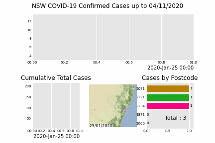
A chart that was built using a development branch of Pandas_Alive is:
Inspiration
The inspiration for this project comes from:
Requirements
If you get an error such as TypeError: 'MovieWriterRegistry' object is not an iterator, this signals there isn't a writer library installed on your machine.
This package utilises the matplotlib.animation function, thus requiring a writer library.
Ensure to have one of the supported tooling software installed prior to use!
- ffmpeg
- ImageMagick
- Pillow
- See more at https://matplotlib.org/3.2.1/api/animation_api.html#writer-classes
Documentation
Documentation is provided at https://jackmckew.github.io/pandas_alive/