Average-Death-Rate
Displaying plot of death rates from past years in Poland
The goal
- collect the data from a CSV file
- count the ADR (Average Death Rate) from years 2015-2019 and 2020+
- change this data to float and add it into a list
- create a python data plot on which OX are the years and OY ADR data
Data source
Data source:
death statistics from 1 september 2015
Demo Tests
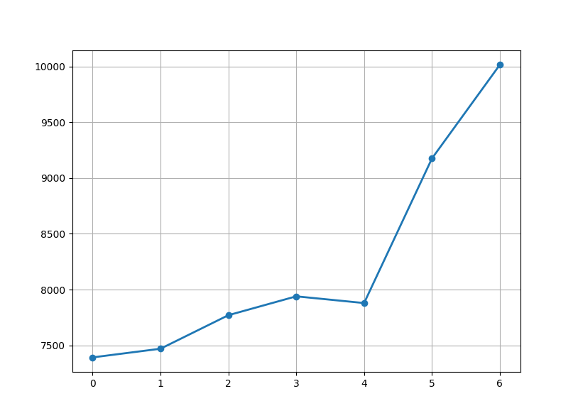
Just to show how does matplotlib work:
In the real project, I will have two plots on one displayed interface. Those are
divided into subplots, which in this case, there will be two of them.
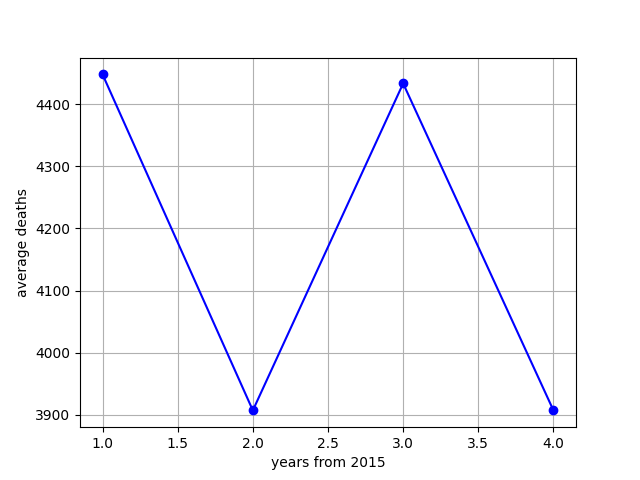
The idea of the first plot. This data is from the actual source (not the one from
my code).
Project source
Charts show data where data arrays are the same. First data array that goes on to
OX should have the same length as data array on OY, so basically x = y without
mentioning data types (except for str and bool). The few things to mention within the code in
src directory are here just in case that you want it to work:
Debuggers
While checking if everything goes alright, I have used DBG's in my code and most of them
are turned off. To turn them on, you can simply just change the DBG state:
    _DBG8_ = True                   # Other
    _DBG9_ = True                   # Standard debug
I have used _DBG9_ to check if class inside of count.py was giving the right answers. Around the class
and programs inside of src directory, after each operation there is a debugger with an if. With a print()
function, I could see if the operation was made correctly and at the same time, I was going on to the next
line to see clearly if the next operation made was successful:
if (_DBG9_): print('ls =', ls, '\n\n')
Screenshots and generating plots
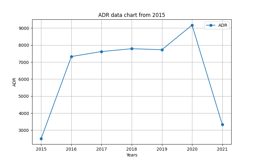
All of these screenshots are made from a data science library to visualize data, matplotlib. On matplotlib, I
set label of OX axis to 'Years' and OY axis to 'ADR'. Of course, the data for 'Years' and 'ADR' was generated within
Operations() class inside of count.py file. Next, I needed to visualize the data on chart, so I used matplotlib
plot function to show data on both, OX and OY axis and decorated them a bit by adding marker argument to plot
function. I have also added a label to the graph:
    plt.title("ADR data chart from 2015")
    plt.xlabel('Years')         # OX label: years from 2015
    plt.ylabel('ADR')           # OY label: ADR (short: average death rate)


    # 2. adding plot:
    plt.plot(ls_years, ls_main_data, label='ADR', marker='o')      # OX data, OY data,
To show the label of main graph, you need to add the following function:
plt.legend()
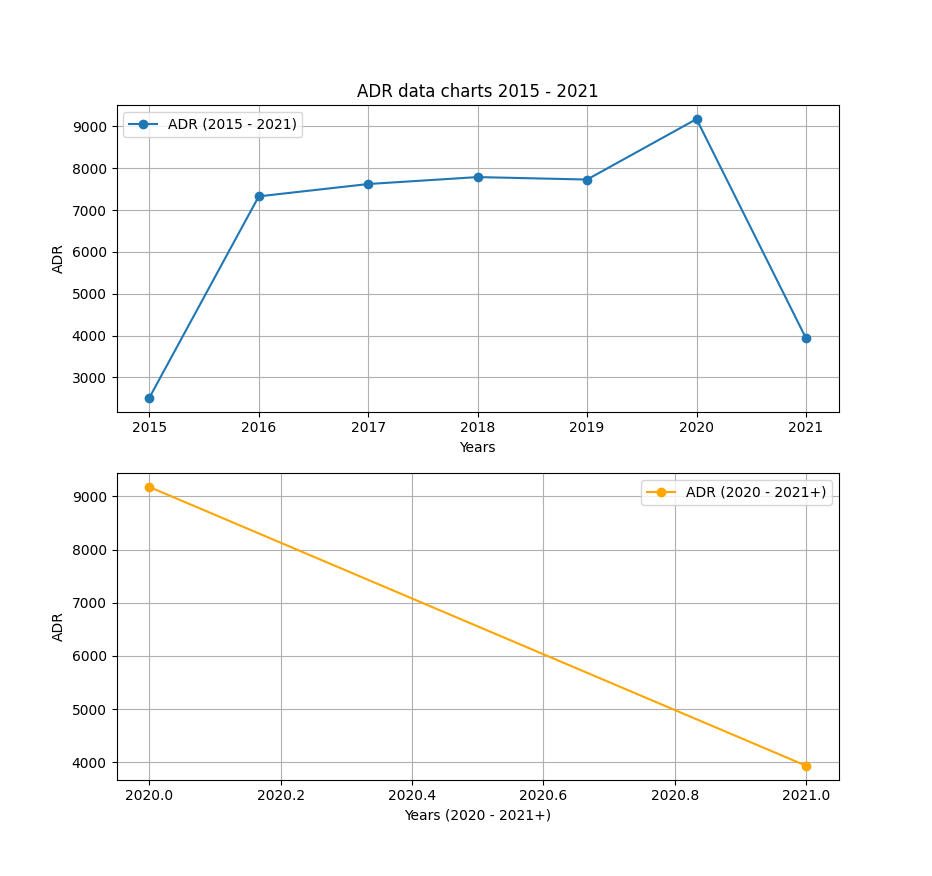
The final result:
The data should be displayed on two plots (or subplots). To do that, subplots() method was used for this. There are
two subplots, and one column. To divide this into two rows and one column, the subplots() takes two arguments which
describes the number of rows and columns:
    fig, ax = plt.subplots(nrows=row_num, ncols=col_num)

    figure, (axis0, axis1) = plt.subplots(nrows=2, ncols=1)      # In this project, this was made using these args
axis0 and axis1 are describing axis that the plot is on. Then for plot method, we don't use plt.plot(), label or
titles because we assign different plots to different axis (in this case):
    figure, (axis0, axis1) = plt.subplots(nrows=2, ncols=1)

    axis0.set_title("ADR data charts 2015 - 2021")
    axis0.set_xlabel('Years')         # OX label: years from 2015
    axis0.set_ylabel('ADR')           # OY label: ADR (short: average death rate)

    axis0.plot(ls_years, ls_main_data, label='ADR', marker='o')      # OX data, OY data
    axis0.legend()
    axis0.grid(True)


    axis1.set_xlabel('Years (2020 - 2021+)')         # OX label: years from 2020
    axis1.set_ylabel('ADR')           # OY label: ADR (short: average death rate)

    axis1.plot(ls_second_years, ls_main_data[5:], label='ADR', marker='o', color='orange')
    axis1.legend()
    axis1.grid(True)

    plt.show()
At the end, we give plt.show() method because we want to display the whole data chart. The final result is here: