Bar Chart Race
Make animated bar chart races with matplotlib.
Installation
Install with pip install bar_chart_race
Usage
Must begin with a pandas DataFrame containing 'wide' data where:
- Every row represents a single period of time
- Each column holds the value for a particular category
- The index contains the time component (optional)
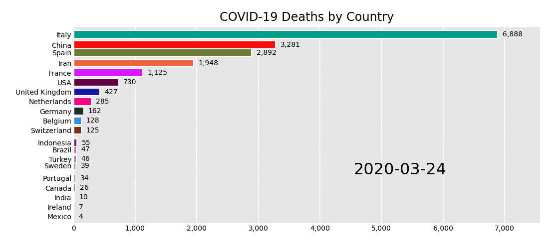
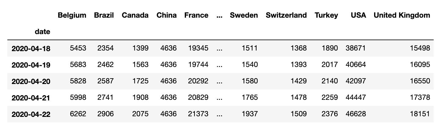
The data below is an example of properly formatted data. It shows total deaths from COVID-19 for the highest 20 countries by date.
Main function - bar_chart_race
There is one main function, bar_chart_race, which we use to recreate the above video. All parameters are shown with their default value except for filename and title.
>>> import bar_chart_race as bcr
>>> df = bcr.load_dataset('covid19')
>>> bcr.bar_chart_race(
    df=df,
    filename='covid19_horiz_desc.mp4',
    orientation='h',
    sort='desc',
    label_bars=True,
    use_index=True,
    steps_per_period=10,
    period_length=500,
    figsize=(6.5, 3.5),
    cmap='dark24',
    title='COVID-19 Deaths by Country',
    bar_label_size=7,
    tick_label_size=7,
    period_label_size=16,
    fig=None)
Save animation to disk or return HTML
Leave the filename parameter as None to return the animation as HTML. You can subsequently embed the animation into a Jupyter Notebook with the following.
In [1]: bcr_html = bcr.bar_chart_race(df=df, filename=None)
In [2]: from IPython.display import HTML
In [3]: HTML(bcr_html)
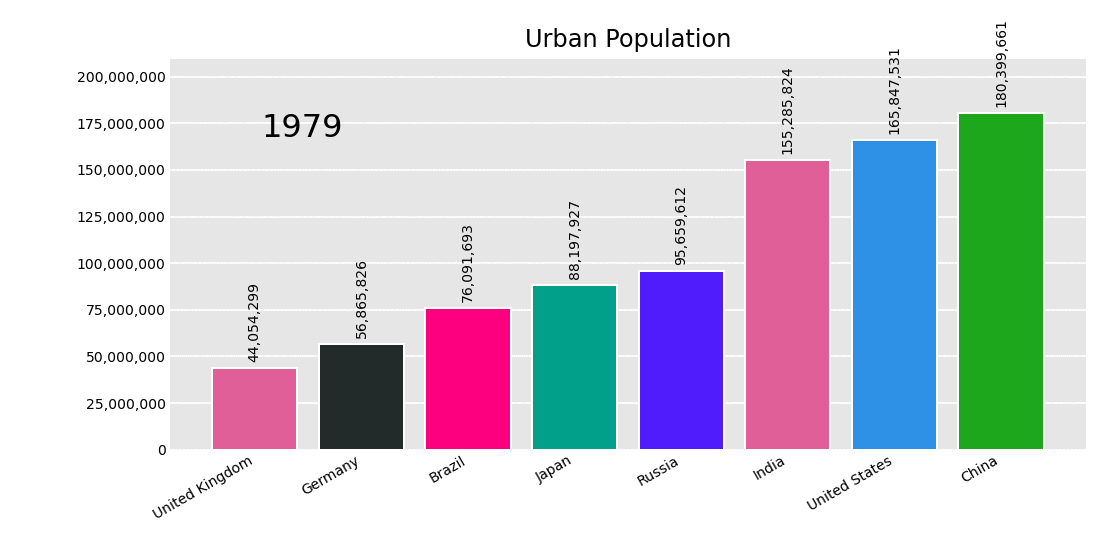
Use vertical bars and limit to top n_bars
Make bars vertical by setting orientation to 'v'. Use n_bars if you want to limit the number of bars. The bars will transition on and off the graph.
>>> df = bcr.load_dataset('urban_pop')
>>> bcr.bar_chart_race(
    df=df,
    filename='videos/urban_vert_asc.gif',
    orientation='v',
    sort='asc',
    n_bars=8,
    title='Urban Population')