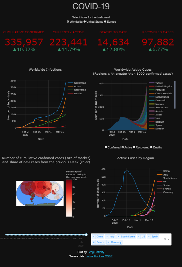
COVID-19
A web dashboard deployed on Heroku at https://covid-19-raffg.herokuapp.com/. Built in Python and Dash, with charts made in Plotly. The data is provided by Johns Hopkins Center for Systems Science and Engineering and automatically updates to the dashboard nightly at 5:30pm, Pacific time.
Focus selection
The dashboard can be set on the pandemic globally, or with a focus on either the United States or Europe through the radio buttons on the top:
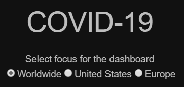
This button changes the underlying data for each displayed chart to reflect the selected region.
Components
There are five main components of the dashboard: the indicators, the infections rates for the selected region, the case analysis by sub-region, the infection map, and the active case comparison chart.
Indicators
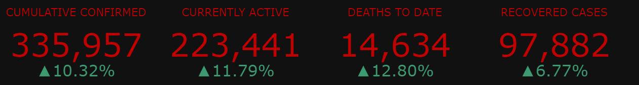
There are four indicators, each consisting of the current value for the indicator, in red, and a percent change from yesterday, in green.
- CUMULATIVE CONFIRMED is the running total of all cases tested and confirmed in the selected region.
- CURRENTLY ACTIVE measures only the cases active today.
It is calculated asACTIVE = CONFIRMED - DEATHS - RECOVERED - DEATHS TO DATE measures the running total of all COVID-19-related deaths
- RECOVERED CASES is the number of cases in which the patient is deemed to have recovered from the illness and is no longer infected nor contagious.
Infections
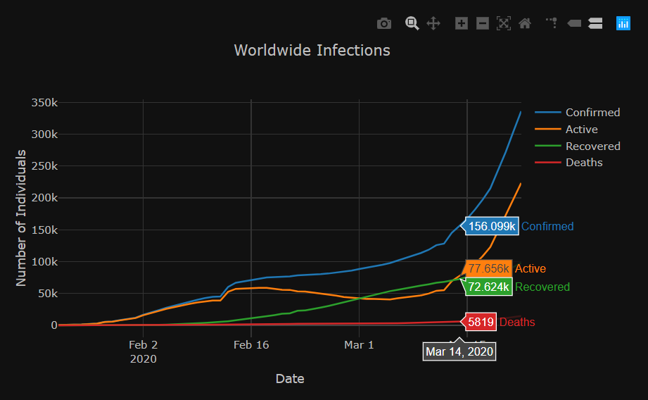
The infections chart displays the totals for CONFIRMED, ACTIVE, RECOVERED, and DEATHS for the selected region, by date. Hovering the mouse over the chart will reveal the counts for each of these measures on the specific date. Using the mouse, you can zoom in and out or click and drag to select a box to zoom in on. Additionally, hovering over the chart (or any chart on the dashboard) will make visibile several control buttons in the top right of the chart. There are slightly different options for each chart, but of particular usefulness is the ability to reset the chart back to original zoom level.
Cases by Sub-Region
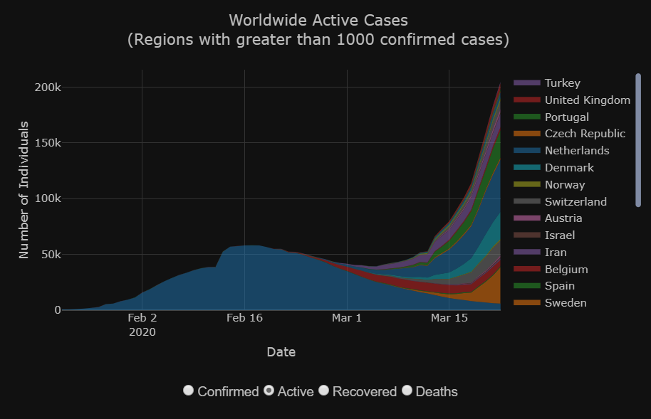
The cases graphic displays a stacked area chart by sub-region of either CONFIRMED, ACTIVE, RECOVERED, or DEATHS, selectable with the radio buttons below the chart. If the selected region is Worldwide, the sub-regions displayed are countries with a cumulative confirmed count of greater than 1,000 cases. If the selected region is United Sates, the sub-regions are the states which have a cumulative confirmed count greater than 20. Selecting the region Europe is much the same as the Worldwide selection, except only European countries are displayed. On hover, the exact count of the selected metric is displayed for the sub-region the mouse is over.
As with the other two line charts on this dashboard, clicking on an item in the legend will temporarily remove that item from the chart. Clicking again will add it back. Double-clicking an item will remove all other items and isolate that singular item on the chart. Double-clicking again will add back all items.
Infection Map
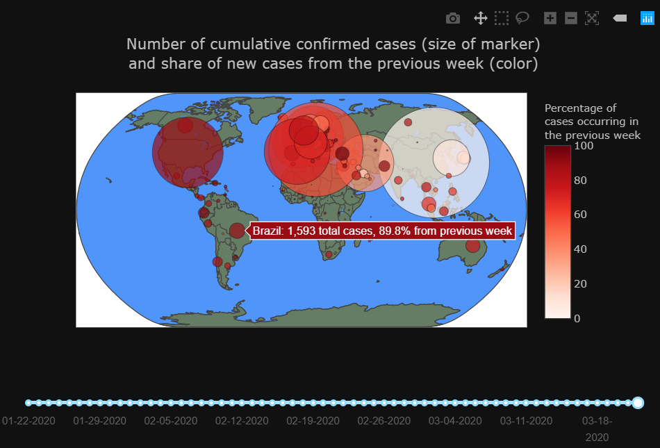
The infection map features a circular marker over each sub-region. The size of the marker is relative to the square root of the CONFIRMED cases within that sub-region and the color indicates the percentage of those cases which were newly confirmed within the previous 7 days. Essentially, the size of the marker is a measure of how many people have caught the virus within that sub-region since the outbreak began and the color is a measure of how active the virus currently is, with dark red indicating the virus is actively spreading and white indicating that it is more under control. Hovering over a marker will reveal the country name and the exact value of the two measures. As with the other charts, the map is zoomable and dragable. Below the chart is a slider bar controlling the date at which the map displays data. By default it is set for the most recent date available but by dragging to the left you can see the spread of the pandemic through time.
Active Cases
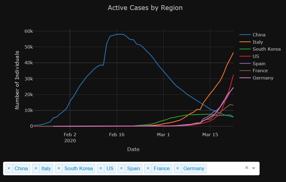
This chart displays data only for cases currently ACTIVE. By default, it displays sub-regions which were of particular interest when this dashboard was created. The dropdown-bar on the bottom allows you to select different sub-regions for display, either countries for the Worldwide and Europe focus or states for the United States focus. Typing in the dropdown-bar will allow you to search for sub-regions.