ridgeplot
The ridgeplot python library aims at providing a simple API for plotting beautiful ridgeline plots within the extensive Plotly interactive graphing environment.
Bumper stickers:
- Do one thing, and do it well!
- Use sensible defaults, but allow for extensive configuration!
How to get it?
The source code is currently hosted on GitHub at: https://github.com/tpvasconcelos/ridgeplot
Install and update using pip:
pip install -U ridgeplot
Dependencies
- plotly - the interactive graphing backend that powers
ridgeplot - statsmodels - Used for Kernel Density Estimation (KDE)
- numpy - Supporting library for multi-dimensional array manipulations
How to use it?
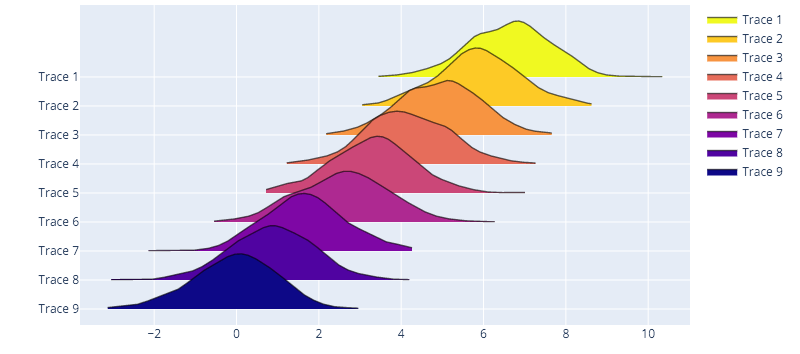
Sensible defaults
from numpy.random import normal
from ridgeplot import ridgeplot

synthetic_samples = [normal(n / 1.2, size=600) for n in reversed(range(9))]
fig = ridgeplot(samples=synthetic_samples)
fig.show()
Fully configurable
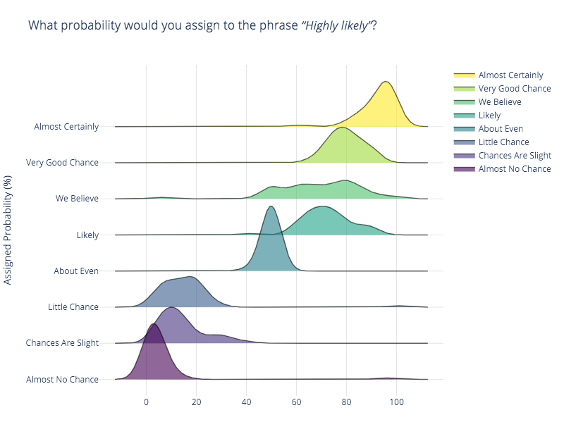
In this example, we will be replicating the first ridgeline plot example in this from Data to Viz post, which uses the probly dataset. You can find the plobly dataset on multiple sources like in the bokeh python interactive visualization library. I'll be using the same source used in the original post.
import numpy as np
import pandas as pd
from ridgeplot import ridgeplot


# Get the raw data
df = pd.read_csv("https://raw.githubusercontent.com/bokeh/bokeh/main/bokeh/sampledata/_data/probly.csv")

# Let's grab only the subset of columns displayed in the example
column_names = [
    "Almost Certainly", "Very Good Chance", "We Believe", "Likely",
    "About Even", "Little Chance", "Chances Are Slight", "Almost No Chance",
]
df = df[column_names]

# Not only does 'ridgeplot(...)' come configured with sensible defaults
# but is also fully configurable to your own style and preference!
fig = ridgeplot(
    samples=df.values.T,
    bandwidth=4,
    kde_points=np.linspace(-12.5, 112.5, 400),
    colorscale="viridis",
    colormode="index",
    coloralpha=0.6,
    labels=column_names,
    spacing=5 / 9,
)

# Again, update the figure layout to your liking here
fig.update_layout(
    title="What probability would you assign to the phrase <i>“Highly likely”</i>?",
    height=650,
    width=800,
    plot_bgcolor="rgba(255, 255, 255, 0.0)",
    xaxis_gridcolor="rgba(0, 0, 0, 0.1)",
    yaxis_gridcolor="rgba(0, 0, 0, 0.1)",
    yaxis_title="Assigned Probability (%)",
)
fig.show()