DataVisualization
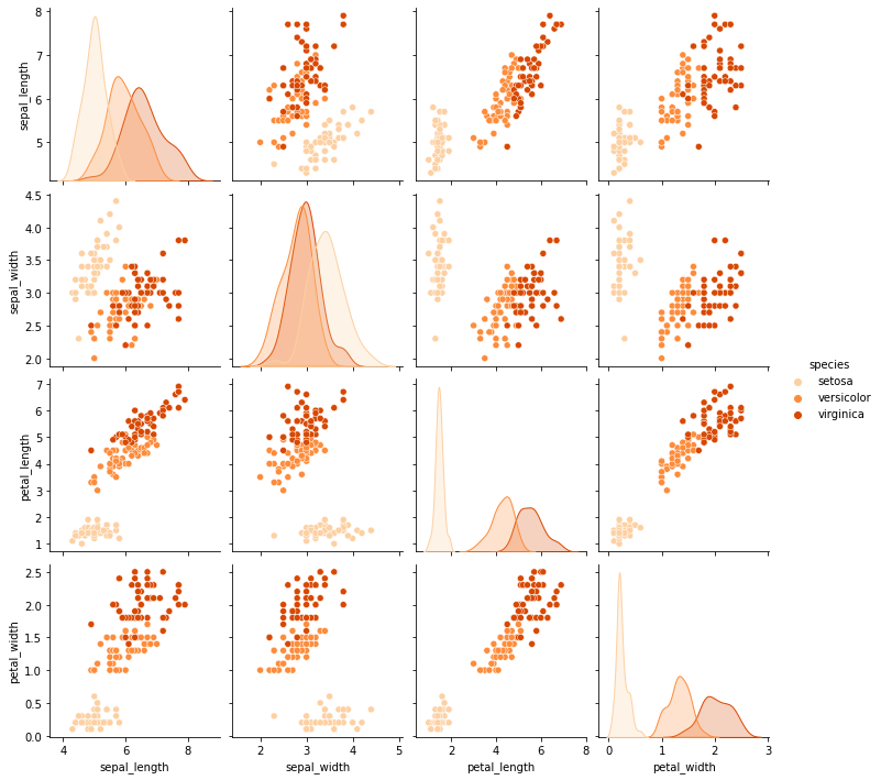
Let's start with the line plots. These are quite useful when trying to show the effects of something or changes among time or other streams. Nearly all of the plots are demonstrated on the iris dataset. All of the plots, codes that are shown, in the following and even more are present in this repo
Area Plot
Area plot is the one of the most using line plots.
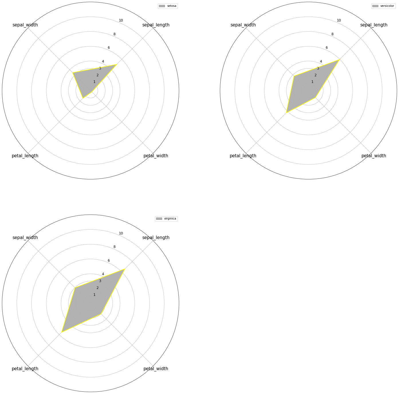
Radar -Spider Plot
Actually, this plot arguably the most used plot in history. FM, FIFA, PES, and many games have been widely used in this plot. Besides all of that this is the plot that I am most familiar with-of course because of FIFA- . I am sorry academia but this plot belongs to the gamers… Sad story..
Line Plot
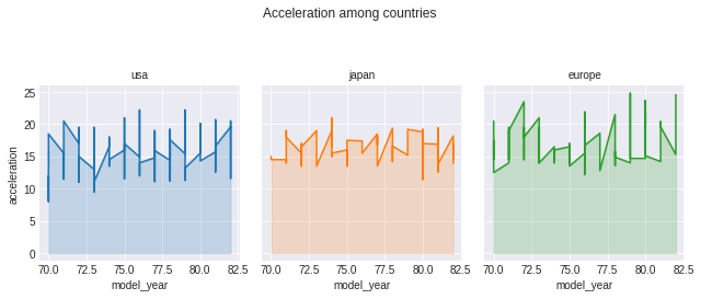
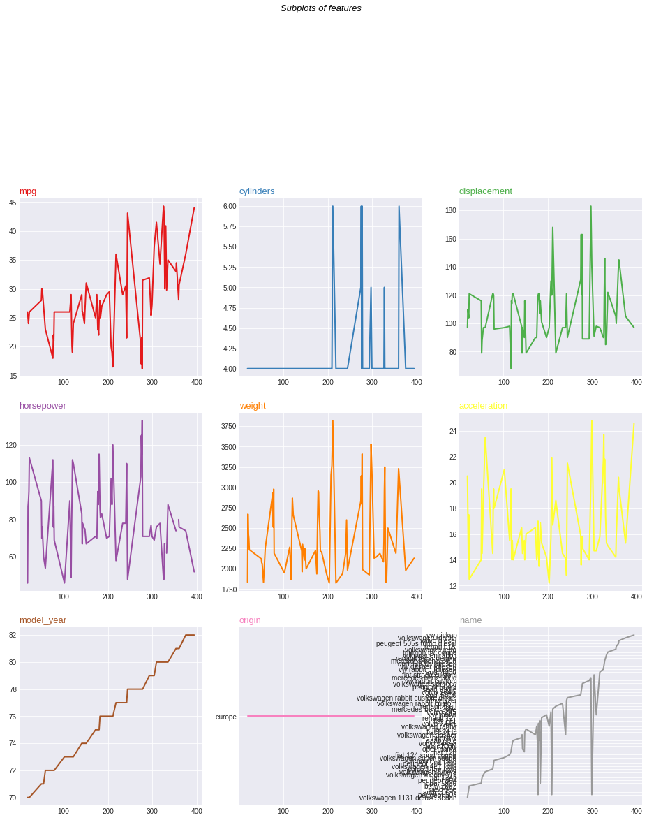
Following visualization is for demonstration of subplots
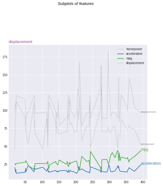
Focused Line Plot
You can see the lines that I focus are colored but the other ones are shaded.
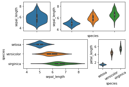
Violin Plot
These plots are very similar to box plots.
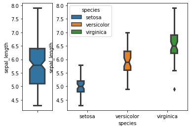
Box Plot
These plots are very useful plots on investigation of data summary.
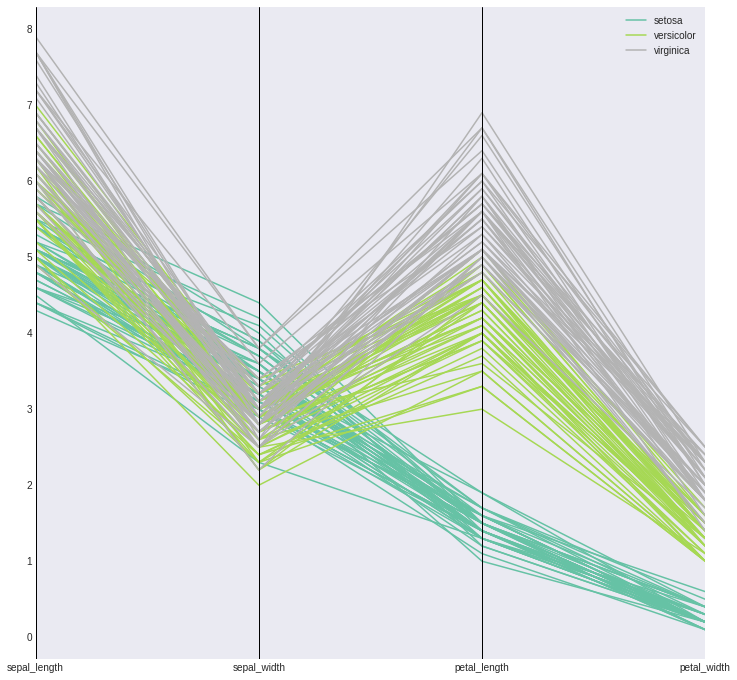
Parallel Plot
These plots are very useful while investigating sequential features like DL model hyperparameters.
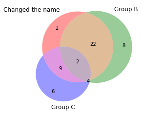
Venn Diagrams
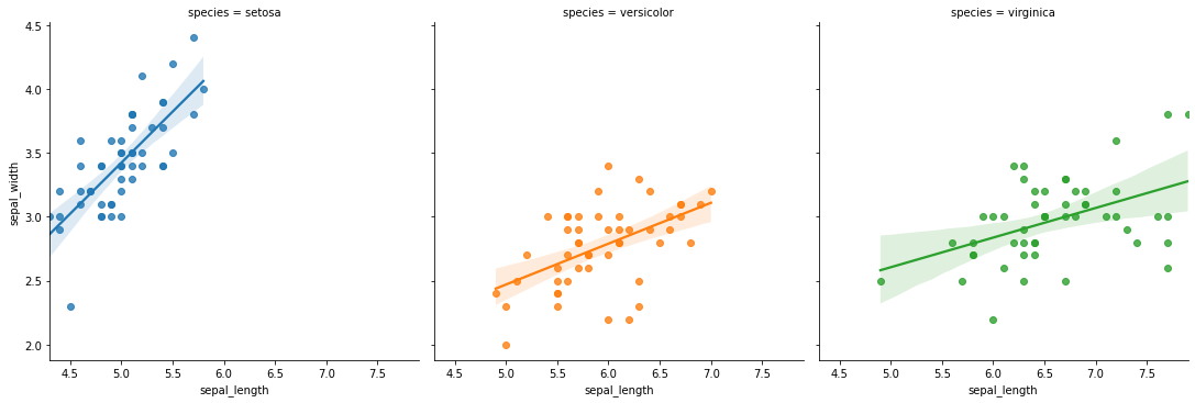
Regression Plot
Correlation Plot
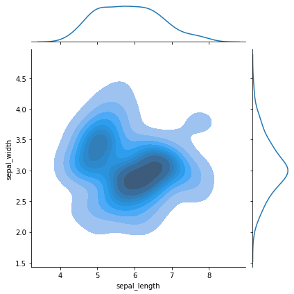
Contour-Marginal Plot