Visualizing Twitch Communities
This project aims to map popular channels on Twitch.tv in a way that feels intuitive to both viewers and streamers. This is accomplished by collecting who is watching different streamers at regular intervals, comparing these lists, and turning that information into a network diagram. All code is written in python and the visualization is done using Gephi.
Results
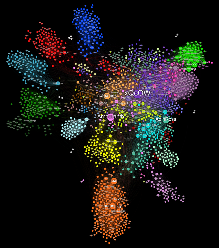
Map 4 (May 2021) - Most Recent
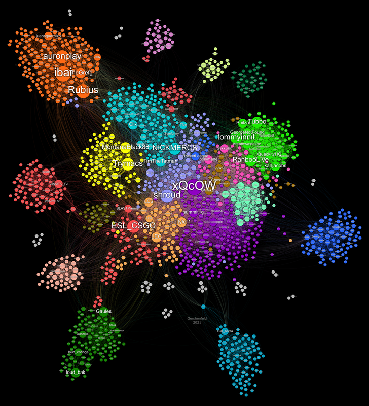
Map 3 (Mid March - Mid April 2021)
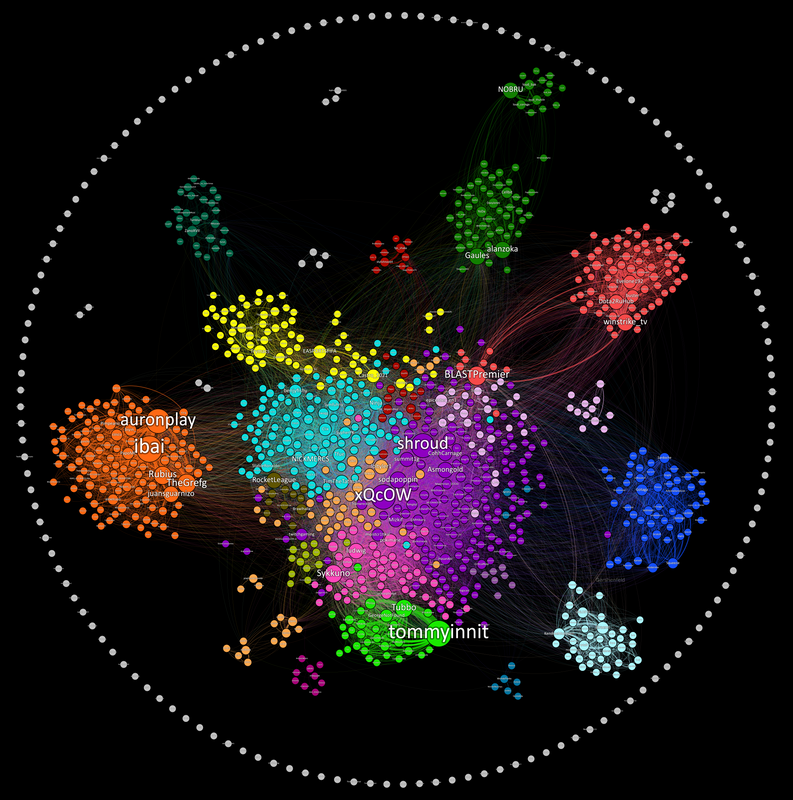
Map 2 (February 2021):
Map 1 (December 2020):
Making Your Own Graphs
If you want to run the project from scratch, collect your own data, and graph it please go down to the "Running The Project" section to get the code running. If you want to mess with the graph using the data I have collected than your in luck! It's super easy and requires no coding.
I used a program called Gephi which while extremely powerful has many bugs, limitations, and problems. You will encounter these in your time with the program so just beware. You can download Gephi for free from their website here. You will also want to download the most recent data in this repository which can be done by navigating the file structure above to "Visualization/GephiData." Pick the most recent date and download the edgelist file and the labels file.
Importing Data
Once you have the software and data, open a new project in Gephi follow these steps:
- Navigate to the Data Laboratory section.
- Click "Import Spreadsheet" and import the edgelist file. Make sure "import as" is listed as "Edges Table" and click next.
- Click Finish on the following dialogue and make sure "Weight" is listed as a "Double". No issues should be found on the following dialogue if this is done correctly.
- On the next screen change "Directed" to "Undirected" and change "New Workspace" to "Append to existing workspace"
- Click ok.
- Repeat the steps 2-5 importing the labels file instead of the edgelist. In step 2 you should make sure "import as" is listed as "Nodes Table"
- Your data is now loaded into Gephi for you to experiment with!
Detecting Communities
If you want to detect communities like I did follow these steps:
- Navigate to the Overview screen.
- On the menu on the righthand side where is says "Filters" click "Statistics". This menu has several algorithsm that you can run and I encourage anyone to research these and learn more about network analysis.
- Next to "Modularity" click "Run"
- In the "Resolution" Dialogue you can put in a value that best suits what you are looking for. Like the description says values lower than 1.0 yields smaller communities while values higher than 1.0 yield broader communities. For my first map I used values in the .75-1.0 range, for the second one I used a values are 0.5-0.75, and for the third map I used around 0.25. The reason for this decrease is because I think the smaller communities are generally more interesting and make the graph seem more accurate when looking at individual streamers. This process has a fair amount of randomness built in so you should run it multiple times and see what you find.
- In the top left "Appearance" menu click the paint pallete
- Click "Partition" and choose "Modularity Class" in the dropdown.
- Click the blue "Pallete" button in the bottom right of the menu and choose a pallete.
- Click apply to color the nodes according to your detected communities!
Laying out the nodes
Gephi has a bunch of layout algorithms built in. You can find them in the "Layout" menu in the bottom left under the "Choose a Layout" dropdown. To get the maps to look the way I did involves doing a few of the algorithms in a row, adjusting a ton of the layout algorithm settings, and a fair amount of precision. I also have some filtering of low weight edges in the "Filters" -> "Queries" menu on the right hand side and I manually move some outer clusters and nodes towards the main graph cluster to make it more cohesive. The details of this will remain a trade secret for now but anyone is capable of similar results with a bit of experimentation.
GitHub
https://github.com/KiranGershenfeld/VisualizingTwitchCommunities


